This is a separate stack within “The Old Believer”. I separated them so that when a new published book is announced, there will be a pinned entry on the main Substack homepage. Also, it gives those who might not be interested in reading about a new publication a heads-up so they can easily pass. There are two new books that have recently been published at Amazon. To see them, click on the image of the book cover, which will take you to its Amazon page.
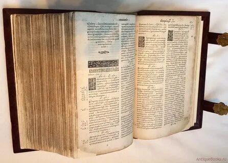
Having just posted about the holy “First-printer” Ivan Fyodorov, I would like to go through some of the features of his Bible:
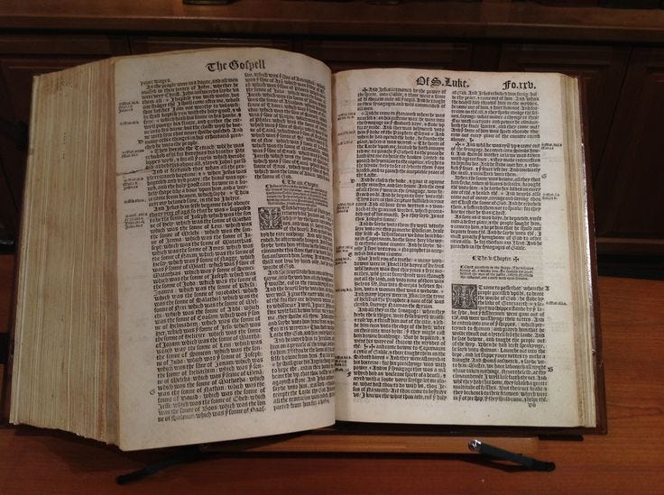
The page layout appears very similar to the 1539 Great Bible and other Bibles of its time. Notable features includes the use of drop cap initials at the beginning of chapters, and plenty of side-margin cross references. During this era, numbering was not according to the page, but the “leaf”, which was the physical page, including both the front (the recto) and the back (the verso). You can see in both of these images the number on the top right leaf, encompassing the front and back, so left pages were never numbered.
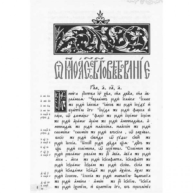
This newly typeset page of the Ostrog Bible gives a clearer view.
Below the header image is the title of the Gospel, in this case, the decorative Church Slavonic font says “From Matthew, the Holy Gospel”, which is also what is proclaimed before any liturgical Gospel reading.
Below the title of the Gospel, the chapter is indicated, followed by some characters that mean, in abbreviation, “Beginning 1”, (Зачало/zachalo), which indicates that the liturgical reading begins in this place as well. So, in this Bible, the Scriptures are subdivided in two ways throughout, the usual chapter divisions, which were the product of 13th century England, and the liturgical readings, which come directly from much earlier Byzantine lectionaries, which were collections of assigned readings for the entire liturgical year.
The lovely thing about these liturgical divisions, is not only do they give you the portion of the Gospel that has been chosen to be proclaimed in the temple, but they are almost always shorter than the chapters, and more consistently reflect thematic unity, in the same way that editorial headings are employed in modern Bibles.
In the 16th century, if you lived in Russia (which would make you automatically an Old Believer!), then all references to New Testament readings were done according to the “zachalo”, not the chapter. There were, as yet, no verses defined, in either the East or West.
As for the marginalia, the Ostrog uses side margins only for cross referencing other books of Scripture. There are no commentary notes in the Ostrog. Fyodorov had published an Interpretative Gospel anyway, which was filled with patristic commentary on the Gospels. I have compared quite rigorously, the cross references from the Great Bible and the Geneva Bibles, to the Ostrog. As expected, they usually agree. But there are several delightful places in which they do not.
The English Bibles suffered from a kind of literalism in their references, that seem to have restricted their references to other places in Scripture that say precisely the same thing, or that highlight the location of referenced people or places in the Old Testament, whereas Fyodorov does this also, but in some places will refer to readings which shed more subtle light upon the reading itself, making the use of his references a fascinating study in itself.
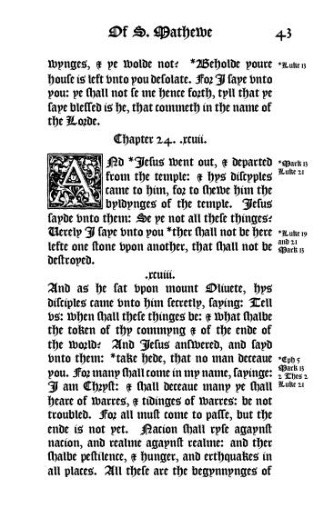
The historical importance of the Ostrog, and its venerated place prompted a special project of mine that I have been working on over the last year. One of the pages is above. In it, I set out to make, as it were, an English Ostrog Bible.
I began by choosing a suitable English Bible to use, prefering one that was contemporary with the Ostrog. You see, when Russians, Greeks, even Latins pronounce the Gospel in their liturgies, they do so through ancient translations.
There are, of course, modern Russian Bibles, modern Greek ones.
But they are not used liturgically. Intentionally so. This is a stumbling block for many, who think it backward, or an attempt to keep the Scriptures behind a veil, as it were. That is another topic altogether.
But there is something indescribably precious in connecting with and hearing the Scriptures proclaimed through a venerated language of the past. This very phenomenon, and the enrichment it brings is enough to justify its continued use. It is like seeing the beauty of one of the ancient icons. Time has not only preserved them in confirmation of their brilliance, but the aging itself adds yet another layer of glorious veneer to what was already worthy.
In a similar way, we have such Scriptures in English as well. They may not be as ancient as the Slavonic, or Latin or Greek, but its assurance through its antiquity cannot be doubted. And must add, as a pompous English addendum, that neither Greek nor Latin ever dreamed of achieving the extent of “universality” that crowned the English language. But, I digress…
I ended up choosing one of the Bibles of Myles Coverdale, whose translations, specifically of the Psalms, remain the most revered English translation to this day. The Bible I used was the 1539 “Great Bible” so named because of its enormous size. It is a curious fact that this particular Bible is the only English Bible to ever receive official royal authorization for ecclesiastical and public reading. The King James, sneakily called the “authorized” version, can only claim a royal commission to create a new version, but once completed, it was never given official royal blessing for use in the same way Coverdale’s great work was by King Henry VIII.
So, once I was able to procure the digital text of the Great Bible, a search commenced for a suitable font that would match the historical glyphs used in the Great Bible. It should be stated here that all English Bibles up to and including the King James 1611 were all printed using the blackletter font (commonly called Gothic). This is another element that I felt was essential to restore, not only because it was part of the original, but also because in reading a blackletter text, you go through the same process that Russians do when reading Church Slavonic texts, which also utilize an antiquated alphabet. It is, to my mind, a sort of gilding of the words to beautify the letters in this way, and it, if only in a subconscious way, whispers always in your ear as you read, that you are reading something important. Something venerable.
Once I was able to convert the plain text over to an accurate historical font, I then went through the Gospels, line by line, to ensure that the liturgical markings placed by Fyodorov matched exactly where I placed them in the English edition.
Finally, although they may already be available in other English venues, I do not know, I translated anew the introductions to each of the four Gospels used in the Ostrog - all attributed to St. Theophylact of Bulgaria. These introductions give succinct context to the Gospels, giving important information on the Evangelist who wrote it, and what sets it apart from the others. These are highly edifying.
Finally, one of the departures I made from both the Ostrog and the Great Bible was to eliminate the two column format. Large, heavy, and complete Bibles are wonderful, but I wanted this edition to be one that was small enough to be easily portable, but large enough that an easily readable font size could be employed. This also meant splitting up the Gospels from the Acts and Epistles. Again, I want this to be a book people will enjoy reading from.
In the beginning, I include some brief notes on how to read the blackletter font and some of its peculiarities. If you look at the sample Amazon provides, this section is there, in full. It has been said, that to read Early Modern English in its blackletter original only requires that you start doing so. This is generally true. It looks daunting at first. But after about 15 minutes, you will start to master it.
You will never be able to read quickly - and this is perhaps the best thing about it. There is a built-in guard against skimming through the Gospels. The very English, its spellings, form, and alphabet demand your focus.
As I hope you can see, this is a labor of love for me - and very near and dear to my heart. I have started to format the book of Acts as well, but this second volume with the rest of the New Testament will be perhaps another year or more off. It is picky work, and very time consuming.
One final note - the Ostrog uses a very small amount of red ink. I had initially intended to utilize this, but using color, even one dot of color in the whole book, more than doubles the cost of the book. When I finish the liturgical Gospel and Apostle books, they will have the red, because there, it is necessary. But we are all already used to reading from Bibles that are printed only in black, so I hope you understand…


Looking into this, it looks like Australia is an expanded distribution site for Amazon, and only for paperback books. Thus, this edition, hardcover only, cannot be sold in Australia. Very strange. I am going to direct message you with a pdf...
It seems to not be available for Australia. Any chance this can be fixed?